
Post by FOA Team
You’ve got a room with blank walls and you want to be innovative. Simply painting them will limit the possibilities. You’re ambitious and ready to take your interior design work to the next level. It’s time to consider the options – what patterns, styles and colors will best bring each room to life? Instead of working in single motifs, should you mix it up?
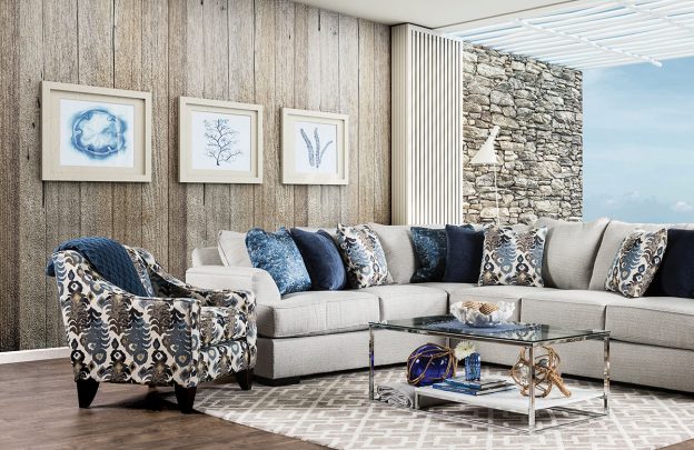
THE ACCENT ALTERNATIVE
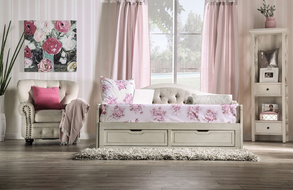
Accent walls can provide a great sense of artful concept and expansive design. Such grandeur can be achieved best by making a canvas out of a single, full blank wall. Often, the one behind a beds’ headboard serves best because of its usual focal-point position. You could use two different wallpapers, one just for the accent wall and the other for the rest of the room. Or when dealing with a solid color that is painted throughout, a single striped wall would create quite an effect. It’s easy to be creative when incorporating an accent wall. Be bold, the results can be as dramatic as you wish.
PLETHORA OF PATTERNS
If you go with a modernistic look, an abstract pattern will serve you well, like one that employs offbeat geometry. Or you can get wild with a glam approach by choosing wallpaper that is shiny, glittery or even embossed. For an all-American country theme, plaid is the most authentic and a gingham pattern can mimic the classic bandannas of the old west. Country motif designs in general celebrate its larger genre. For a rustic flavor, choose from innumerable variations of printed wood grain patterns. You could even pick a wildlife theme to really drive the concept home.
CORRESPONDING COLORS
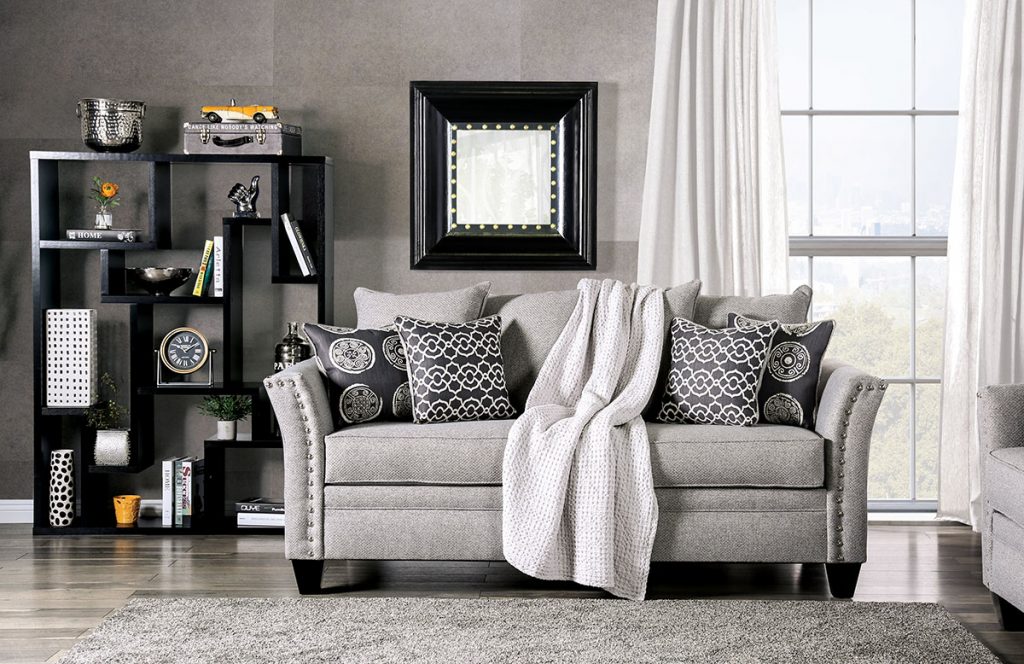
Make an assessment of your room’s color scheme, taking the present furniture, decor and flooring into account. Your wallpaper choice should serve as a reflection of it all. For a substantial effect, find wallpaper that uses a hue identical to the room’s prominent color accent. Or, in a painted room where the décor has already been established, simply use wallpaper that in some way features the same color as the existing walls. So when you put the paper over them, it’s an instant perfect match.
PRACTICALITY VS REGALITY
Visual harmony is important. To help achieve it, you must also factor in a rooms function. For instance, in a casual setting, you might consider a light floral/botanical-patterned wall paper. On the other hand, a formal setting could employ designs of greater elegance or sophistication like the rich damask patterns inspired by the intricately woven cloths of vintage royalty. Such Victorian settings, with period floral styling, serve to elevate a sense of regality though modern tastes are generally more modest…